
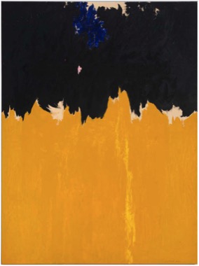
PH-950, 1950
Clyfford Still
PH-950, 1950
Oil on canvas
233.7 x 177.8 cm
Clyfford Still Museum, Denver
Courtesy Clyfford Still Museum, Denver, Colorado
© City and County of Denver, VEGAP, Bilbao, 2016
“The pictures are to be without titles of any kind. I want no allusions to interfere with or assist the spectator.” Clyfford Still, 1949[1]
Clyfford Still (Grandin, North Dakota, 1904−Baltimore, Maryland, 1980) was among the first generation of artists that embraced Abstract Expressionism, a movement that emerged in the USA in the 1950s, just after World War II. Like other painters, Still began to work in this particular style by experimenting with new approaches and rejecting traditional methods, such as keeping the canvas on an easel or applying paint with a brush[2]. These artists turned away from figuration—in other words, from depicting the world as we see it—and instead proposed a new take on reality, using a visual language based on shapes, colors, and lines. Their painting was highly expressive, giving rise to compositions that are usually unstructured and unsystematic.
At the time, critics attempted to classify the Abstract Expressionists into two categories: gestural abstract painters and color-field painters. The former encompasses artists whose work is marked by the physical gesture of painting, while the latter emphasizes the application of color in large areas that characterized other painters. However, Clyfford Still managed to strike a perfect balance between both categories. In reality, each Abstract Expressionist had his/her own personal style and language.
After 1947, Still worked exclusively with large formats, covering his canvases in colors coarsely applied with a palette knife. The absence of figures made the larger color fields look like continuous surfaces. The artist also deliberately chose unsettling hues to create extraordinary works. Unlike most painters of his day, Still ground and prepared his own pigments to create the unique colors he applied to his enormous canvases[3].
In PH-950 (1950), Still expressively applied paint to the canvas with a palette knife to produce large swathes of color, layering different tones. On the canvas, the dense material surface gives the impression that a layer of color has been "torn" off the painting to reveal the underlying hues. The luminosity of the orange-yellow area was achieved with carefully applied brushstrokes in intense hues, and the density of paint is uneven across the surface, which gives the painting a flickering effect[4]. The usual recognizable figures have disappeared and been replaced by flame-like forms that rise vertically through expansive color fields[5]. Rejecting symmetry and balance, Still created an original composition and allowed the oil paint to run off the edge of the canvas, implying an unlimited vista of abstract forms and color[6]. Yellow and black face off on a vertical space. The luminosity rises to confront the black abyss above, and where these two colors collide, the white of the ground peeps through like the foam of cresting waves. The same white reappears at the top of the canvas, drawing the eye toward the edge of the painting.
Still did not assign titles to most of his paintings, not wanting to give away any information about the work. The numbers and letters assigned to this piece, PH-950, are actually a catalog of the photographs that Still's daughter took of his works.
There is something in the painting's huge expanse that might recall a landscape from the artist's youth[7]. For years, he worked the land with his family on the bleak Canadian prairies of Alberta, and he had to weather the crisis of the agrarian economy that accompanied the Great Depression. Despite this resemblance to a landscape, Still's intention was for his work to transport viewers to an emotional and spiritual state, not to remind them of a specific place. In his own words, his works are not "paintings in the usual sense: they are life and death merging in fearful union"[8]. The artist worked with the expressive power of colors, with their bright and luminous or dark and muted appearance. By confronting colors, he evoked a conflict between good and evil, life and death.
Preguntas
Look carefully at Clyfford Still’s work. Take time to observe all the details. What do you notice? Can you make out any forms? How do you think it was painted? Describe the materials you think he may have used.
Although Still denied any direct associations with landscape imagery in his work, some critics linked his paintings to vistas of the vast American plains. If this work were a landscape, where would it be? How would you describe it based on the shape and color of the painting? Does it remind you of any particular place you’ve been to? Which one?
Describe the colors you see in this work. Still was an outspoken proponent of the idea that abstract painting could portray his inner psychic state, and consequently denied that his work bore any similarity to landscapes. The painter said, “I paint only myself, not nature”[9]. If you had to describe the dominant mood of this painting, what would it be? What feeling or sensation do you think this work might convey?
In addition to disliking associations, Still refused to title his paintings and rejected the titles he had given to his early works, believing that they would influence the viewer’s experience of the work too much[10]. What do you think of this idea? Do you believe a title can influence how we perceive a painting? Do you think the same thing can happen with a book or a movie? If you had to give this work a title, what would it be?
One of the hallmarks of Still’s art is the enormous size of his canvases. The artist created monumental paintings with the idea of enveloping the spectator. How do you think size can alter your perception of a work? Do you prefer to look at large or small works? Why? How do large-scale works make you feel? If this painting were the size of a sheet of paper, how would it change your perception?